
Team
Solo Project
Period
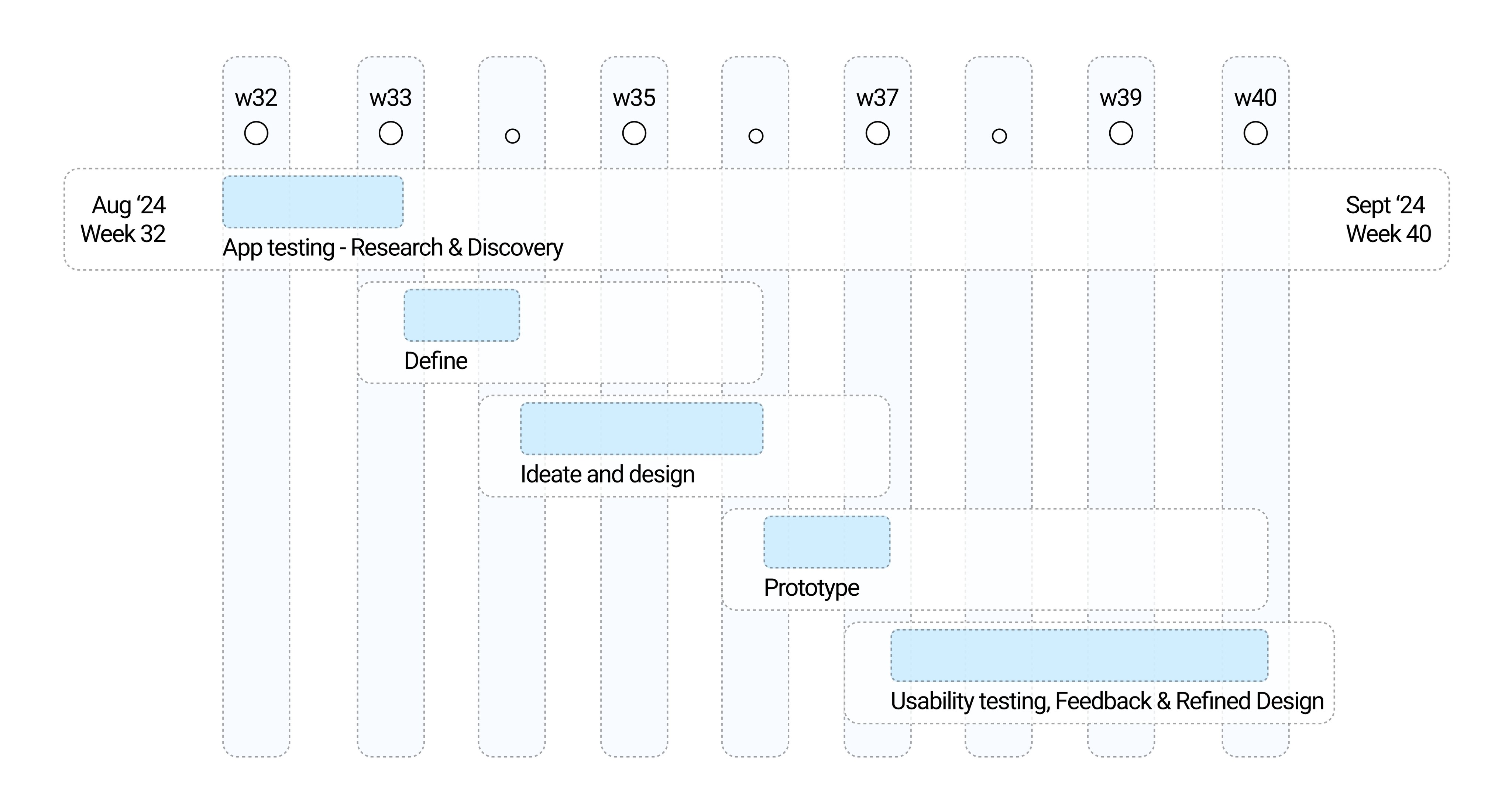
August 2024 - September 2024
Role
Product design,
User research and Visual design
Tools
Figma, Figjam, and Illustrator
What does Kicktipp do?
Lets you create or join sports prediction leagues
Kicktipp allows you to join or create sports prediction leagues to compete with your friends and peers, using a points system where you make predictions and track their performance across various sport events.
The Case for a Redesign
Personal and peer experiences
During the Euros 2024, my office organized a prediction game, where a colleague introduced us to the Kicktipp app. It quickly became popular and I was surprised to find that friends from other offices were also using it, and by the start of the tournament, almost everyone had it installed and joined the various leagues. However, as we used the app, we noticed its usability issues, with the interface, especially when navigating between different leagues, which affected the overall experience. These concerns were shared by others as well and it marked the beginning of my UX research, eventually leading to a redesign of the original app.


Simplifying predictions with a
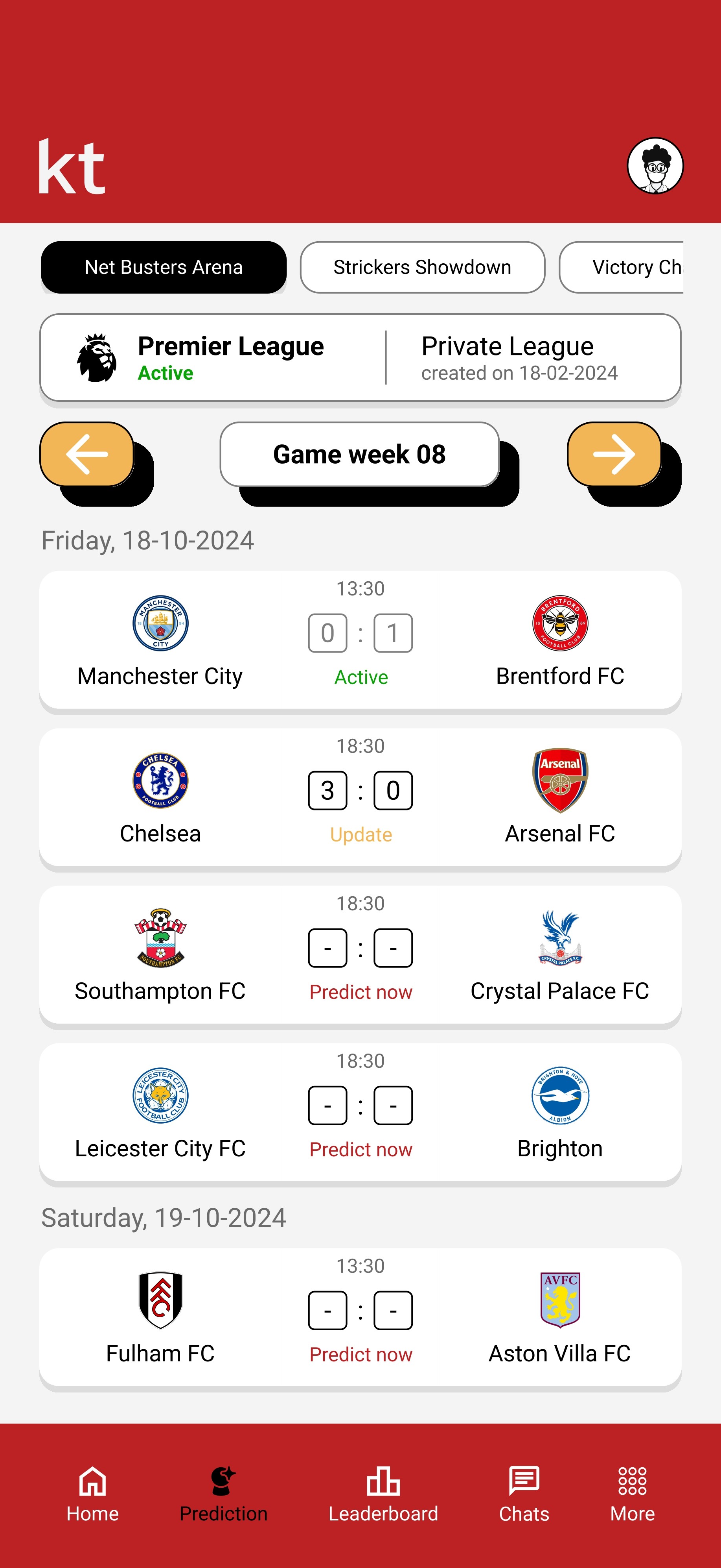
Game-by-Game layout
Sorting games by gameweeks and using a horizontal slider to navigate between leagues makes it easier to switch leagues and select your choice of games for predictions.
Compete with friends in different leagues
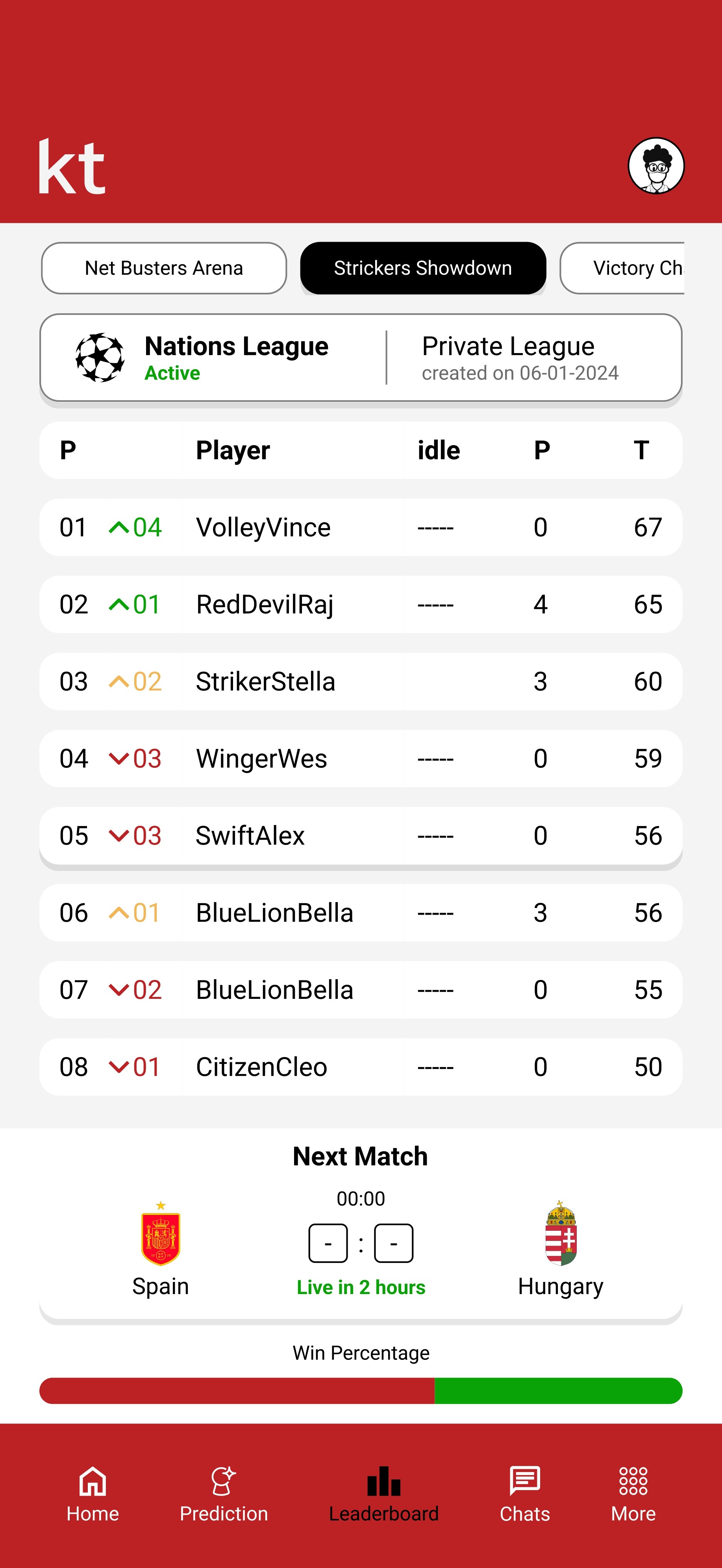
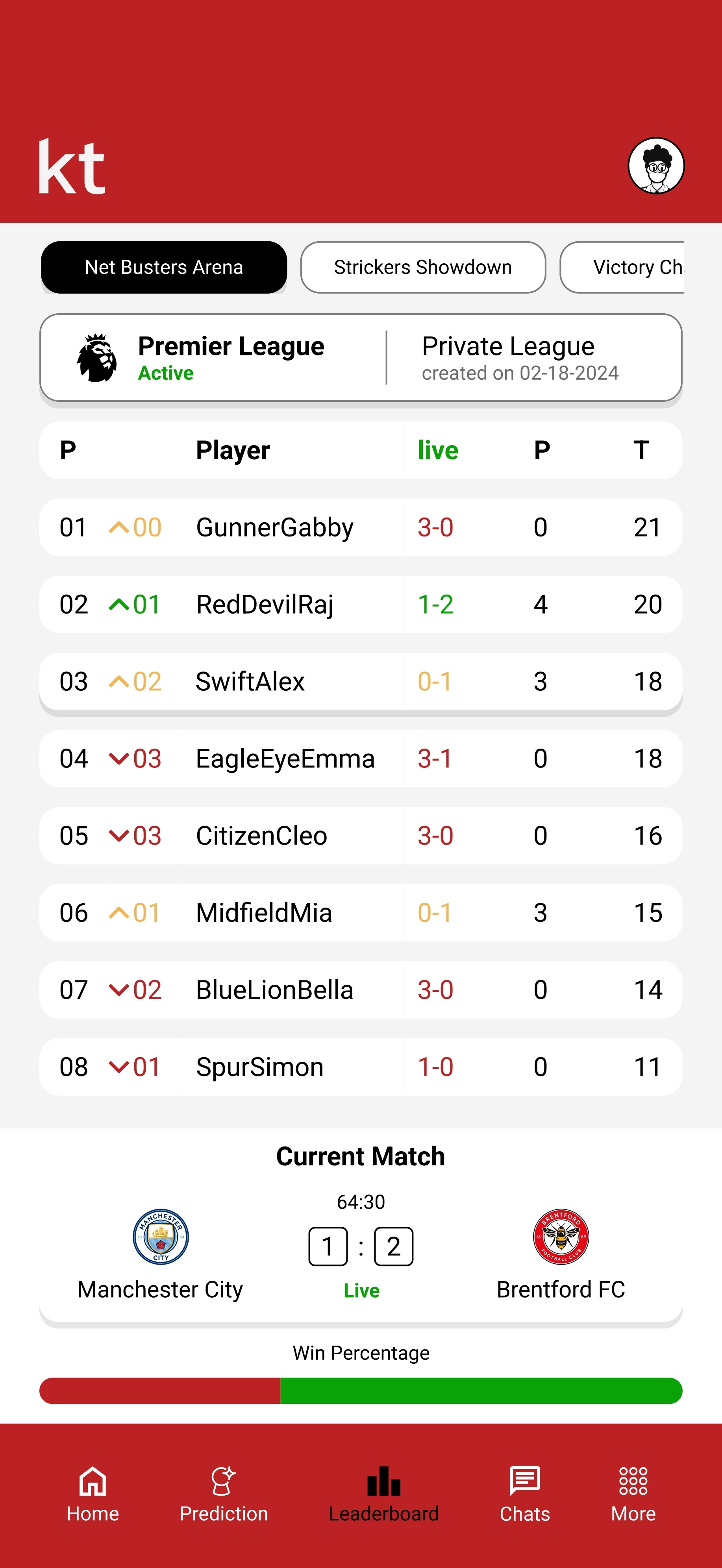
A clear picture of where you are on the leaderboard, with an accurate points distribution system, based on ongoing games.



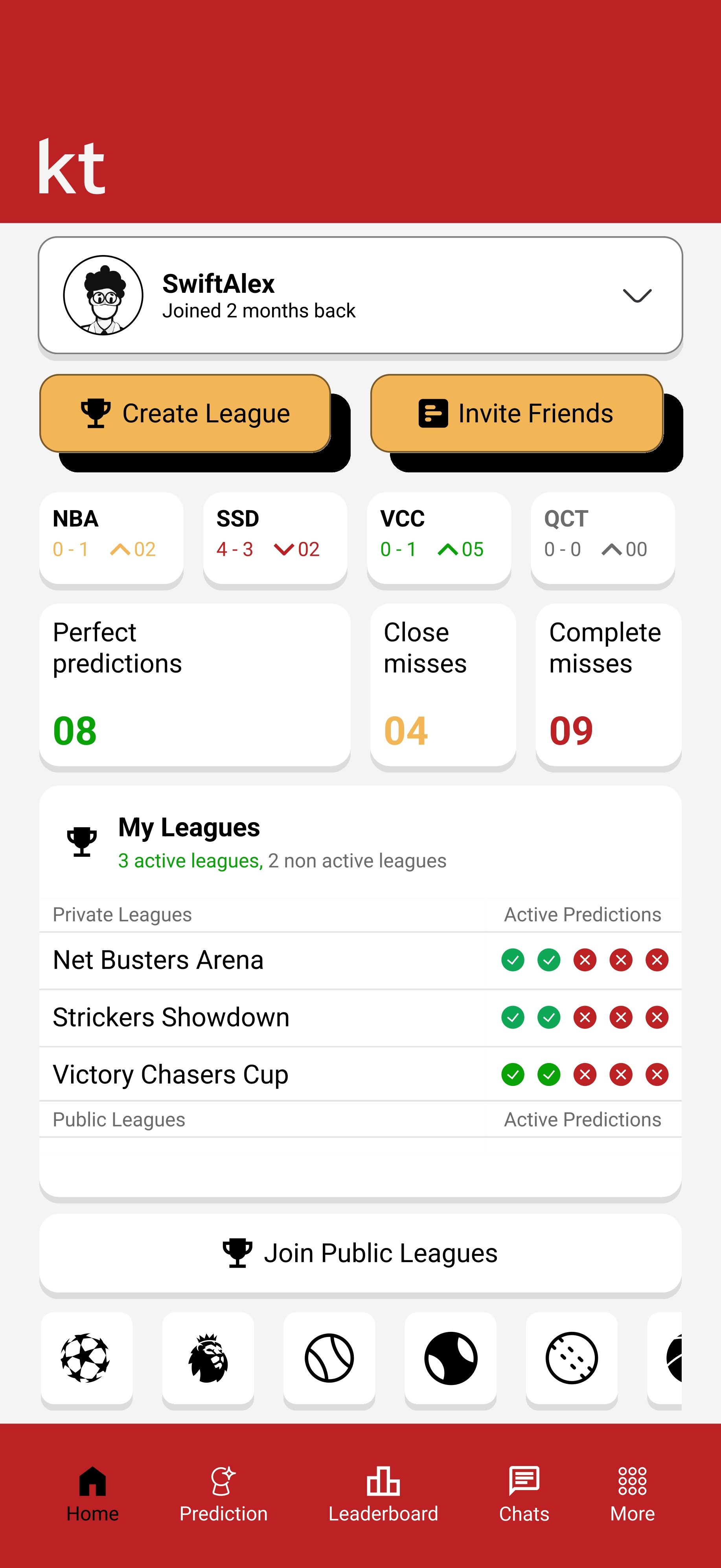
Home Screen with Live Stats
Shows the different leagues you are in, assorted and classified, providing a quick overview of your current performance. Briefly displays with clarity a list of various public and private leagues you are participating in as well.
Primary Research
User interviews and feedbacks
X 5
Reviewers
I conducted interviews with several users, including both colleagues and friends who used the app regularly during the Euros 2024

Efison
@Sweden
"Navigating through the app feels confusing, especially when trying to switch between different leagues. There are too many options in there, and often hard to find what I'm looking for quickly."

Arnoldiho
@Abu Dhabi
"On match days, it’s hard to know where to submit my predictions, and I have often missed deadlines because of the interface not guiding me good enough."

Aashna
@India
"Sometimes I feel lost when switching between the leagues. It’s hard to track my progress across the multiple leagues in one place."

Evi
@Netherlands
"I found it quite tricky to understand the points system at first, and had to jump back and forth to figure out how the scoring worked."

Elif
@Sweden
"The app should be simpler and faster to use. There’s just too much going on, and it takes away the fun."
Highlights
Users struggle with cluttered navigation, making it difficult for a smooth switch between different leagues.
The prediction submission process lacks clarity, and important actions like submitting predictions are not easily accessible.
Users desire a more streamlined interface that reduces complexity and makes the prediction process quick and more enjoyable.
Users face difficulty tracking their performance and navigating multiple leagues in an intuitive way.
The points system and the scoring process are not clearly communicated, causing confusion and frustration for users.
Secondary Research
I reviewed user feedback for the app in App Store, and here are some key insights
Positive aspects
Users appreciate the simplicity and reliability of the app, especially for creating private leagues and predicting on various competitions such as the EURO, Premier League, and World Cup. Many mentioned that the real-time scoring and the alterable rules make the app enjoyable and engaging too.
Usability challenges
While the interface is described as simple, some users reported that navigating through the app, especially switching between different leagues or finding certain options, could be more intuitive. This aligns with the feedback of the user interviews I took, regarding the navigation and interface issues.
Performance issues
Some users have reported bugs and other performance issues such as app crashes or lags, particularly during a peak usage time like a major sporting event. While the app has been improved with regular updates, like the recent bug fixes, this can still be an area for future optimization.
Competitive Analysis
I have identified some other competing apps that offer similar experiences, and here are some key insights

Superbru
The variety of sports is overwhelming if users only follow one or two.
Limited customizations for the visual layout.
Easy to follow live updates and leaderboards.
Large community and social engagement tools.
Simple and intuitive interface with rich data on user performance.

Teamtip
The focus on football alone limits appeal to users who follow other sports.
No options for an in-depth analytics or social interaction.
User-friendly interface with minimal navigation barriers.
Clear and easy-to-understand rules for predictions.
Minimalistic approach reduces a lot of user confusion.

MPP
Limited to social connections; lacks options for solo play or playing with strangers.
Not as many sports or prediction options as some other apps.
The app’s design encourages users to interact with friends, making it feel more like a social network than just a prediction game.
Clear visual hierarchy and easy navigation between leagues.
Feature Matrix
Priorities and next steps
Must have
Necessary for the product
Improved navigation between leagues – Users struggle with this, and simplifying it is crucial.
Enhanced user interface – Simplifying the UI for quicker, hassle-free predictions.
Leaderboard clarity – Improve how user positions and points are presented to enhance competitiveness.
Should have
Good for long run
Live tracking of predictions – Providing real-time updates and better prediction tracking can boost user engagement.
Expand sports options – Including more sports will broaden the app’s appeal, ensuring it attracts users beyond football.
Could have
To improve product worth
Chat or social feed – Strengthening the community aspect by adding a robust chat or social feed would increase engagement and make the app more dynamic.
Better social features – Implement a better social interaction feature with public/private league accessibility. This will encourage user retention.
Won't have
May ignore it for now
Overly complex features – Avoid introducing complicated game mechanics that could alienate casual users looking for simplicity.
Pain Points
Navigating
between Leagues
Difficulty switching between different prediction leagues.
Indefinite Visual
Hierarchy
Confusing interface design affects ease of use.
Real-time
Data Delay
Slow updates during live matches affect user engagement.
Overcomplex
Predictions
The prediction process feels unnecessarily complicated.
Lack of Social
Engagement
Limited social features reduce user interaction.
Complex
Account Setup
The registration process might be overly complex for new users.
Cluttered
Dashboard
Information displayed
on the home screen is untidy.
Selection for Language
Options
The app language selection pops up every time you log out of leagues.
Inconsistent Design
across Devices
The interface design is inconsistent across different device platforms.
Empathize
Understanding users' needs and pain points
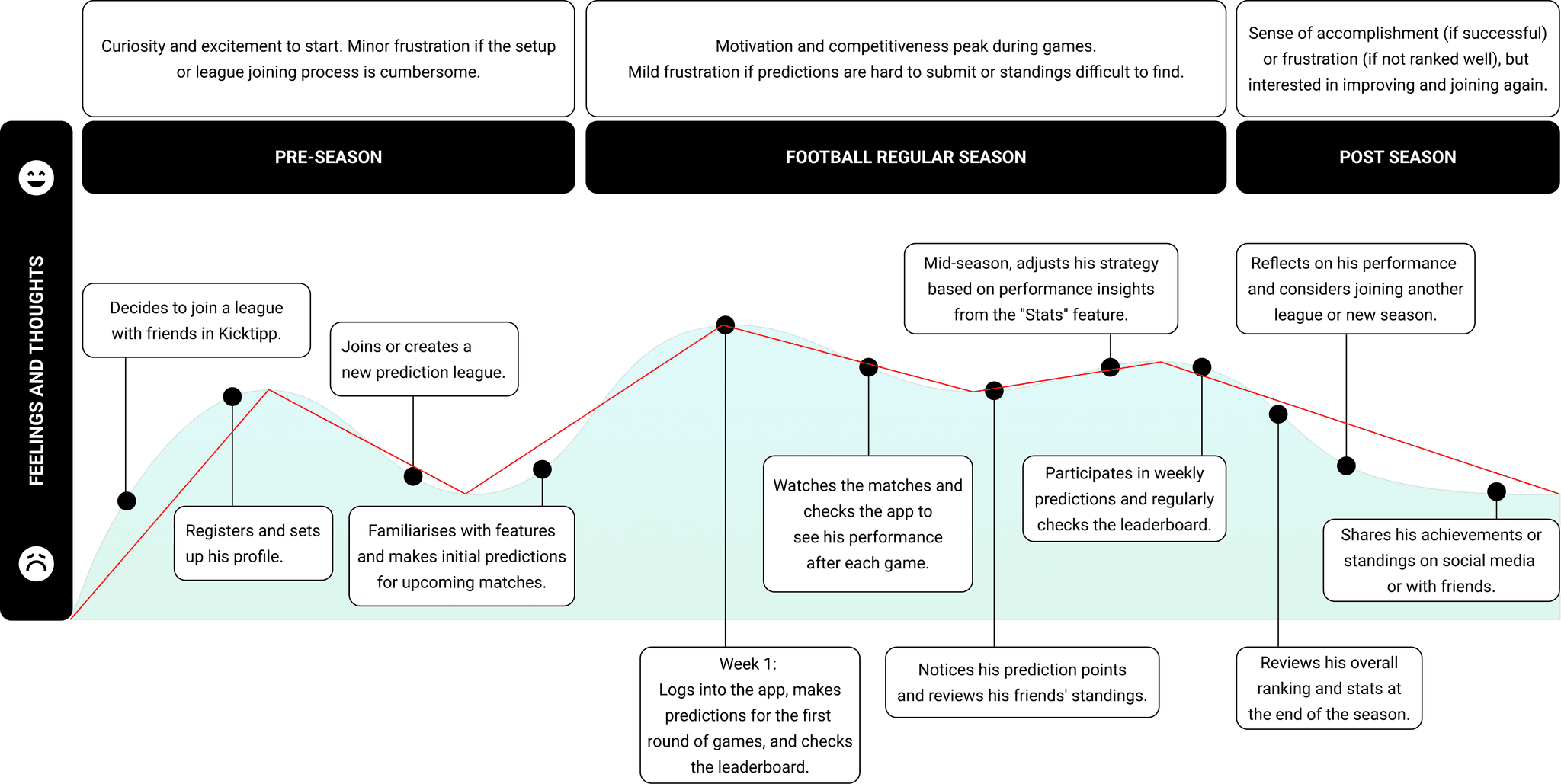
Based on the research, I have crafted a user persona to represent the target audience, ensuring the redesign aligns with the needs and motivations of dedicated users like Alex, in this case.


Alex Johansson
28 y.o, Male
Location: Stockholm, Sweden
Occupation: Data Analyst
Tech Savvy Level: Intermediate
Goals
Quickly log in and showcase the predictions and leagues he is part of.
Make accurate predictions without navigating too many screens.
Check stats and leaderboards efficiently to gauge his performance.
Access upcoming fixtures and predictions to stay informed about the next games.
Seamlessly exit the app when done without unnecessary steps.
Bio
Alex is an enthusiastic football fan who enjoys predicting game outcomes and competing with friends in different football leagues. He works full-time as a Data Analyst, and so he values efficiency and precision. Alex has been using the Kicktipp app for about a year, and while he appreciates its concept, he often finds the user interface confusing, especially when quickly navigating the app to make predictions or to check stats.
Frustrations
Difficult-to-locate features and overwhelming menus.
Slow process for submitting predictions.
Inconsistent layout and design, making navigation unpredictable.
Challenges with logging in quickly.
Motivations
Alex wants to stay updated on football games, engage in friendly competition, and follow leaderboards. He is competitive and checks his standing on the leaderboard frequently to stay motivated.
Ideate
I aim to identify the key features or focal points that will help users achieve their goals more easily
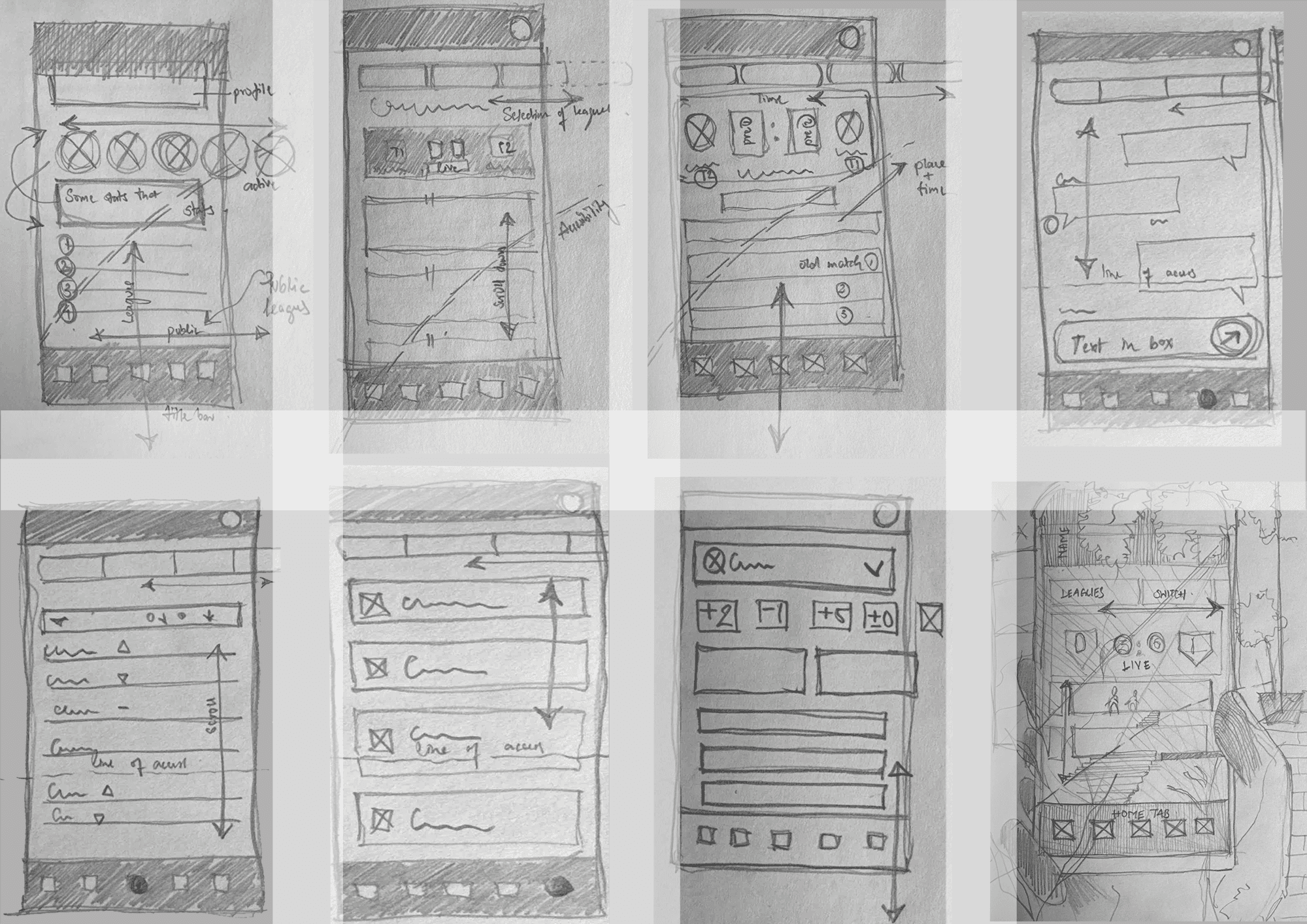
After conducting thorough research and identifying key features, I began the ideation process by using the Crazy 8s method. I divided a sheet of paper into 8 sections, dedicating one minute to each section to rapidly sketch ideas. This approach allowed me to explore a variety of concepts and potential solutions for improving the user experience.
Hybrid Card Sorting for Information Architecture
For an intuitive structure of the app, I conducted a hybrid card sorting exercise with 5 participants.
This approach allowed participants to organize features into predefined categories and suggest new ones,
ensuring the information architecture aligns with user expectations and goals.
Home
01 - Overview
A landing space you see right at the start
02 - Prediction status
To see active predictions and inactive ones
03 - Recent predictions
Previous prediction status
Predictions
01 - Direct access to upcoming games
An easy understanding of where to feed info
02 - Deadline reminders/status
Showing which matches have active and inactive feeds
03 - Clickable tabs for match details
Information that can help the user to predict
Leaderboard & Stats
01 - Insights on rankings
A display of where your position is in the board
02 - Player performance.
A live update on how the standings change
Chats
01 - Social engagement
Conversations within a league
02 - Easy switch between leagues
Possibility to access other leagues within the app
Profile & Settings
01 - Account management
02 - Notification preferences
03 - User support
Onboarding
01 - Intuitive pop-ups for familiarizing
At this phase of my redesign, I have
decided not to include onboarding,
as my focus is on refining core user
flows and essential features to address immediate pain points. Once the primary structure is optimized, onboarding will be considered to ensure it aligns seamlessly with the final design.
Information Architecture
Based on the Hybrid card sorting, I created an Information Architecture that meets user expectations
Home
Predictions
Leaderboard
Profile & Settings
Chats
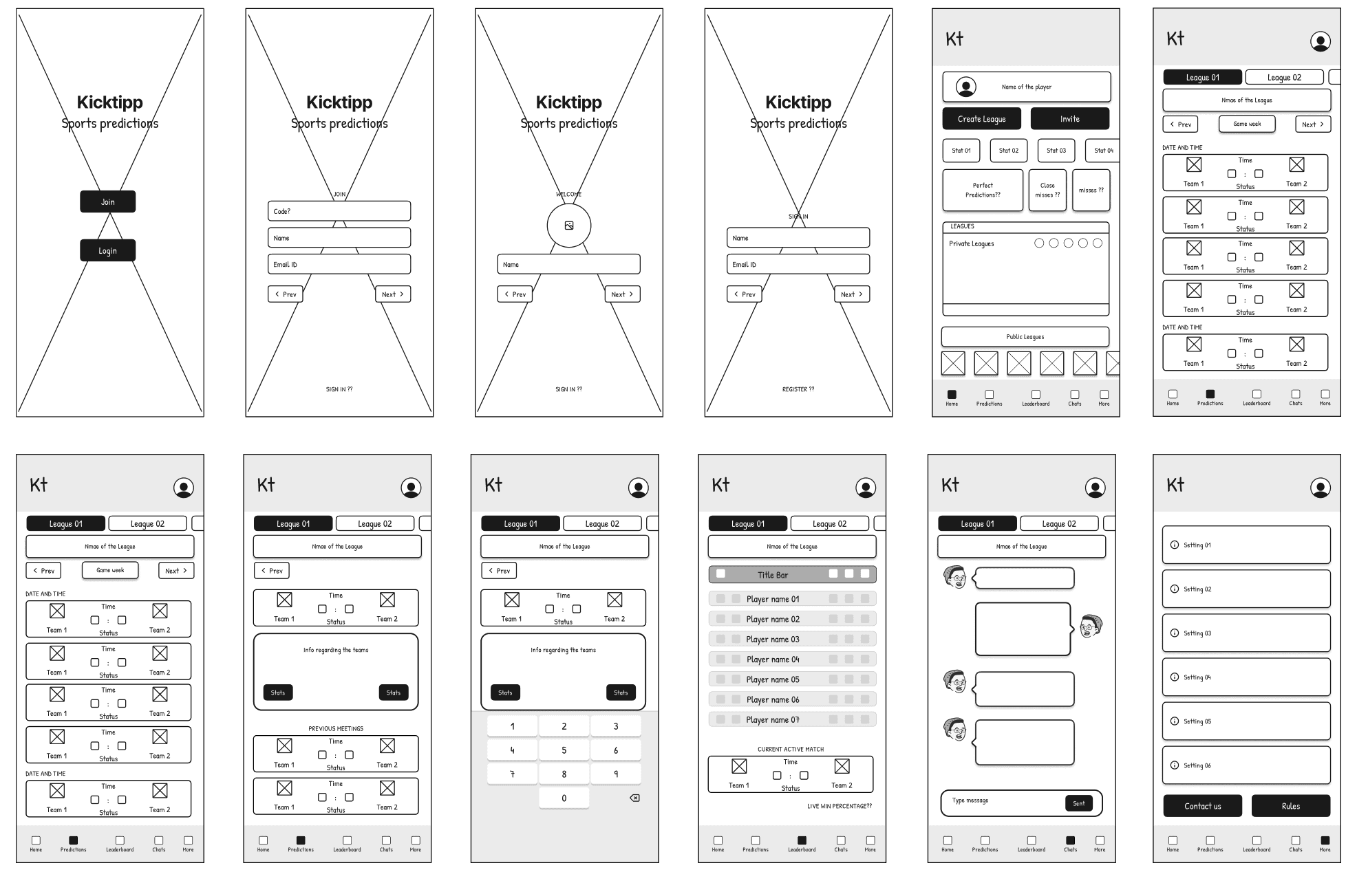
Lo-Fi Wire-framing
I tested several variations based on feedback and progressed to the prototype stage
High Fidelity Design & Comparison
Here, I am comparing the original design with the proposed redesign
Original
After Login - Home Screen

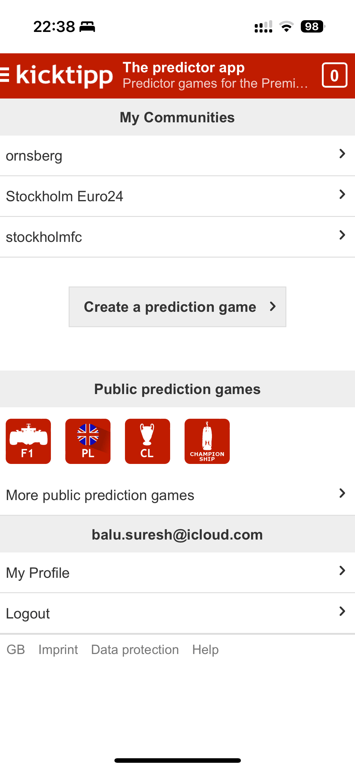
Stats area
The redesign enables real-time performance tracking, a feature missing in the previous version, where progress was only visible in the leaderboard section.
New bottom tab
The new design allows smooth and easy switching between predictions and leaderboards, unlike the old version, which limited this to a specific league or community.
Redesign
After Login - Home Screen


Original
Prediction Section

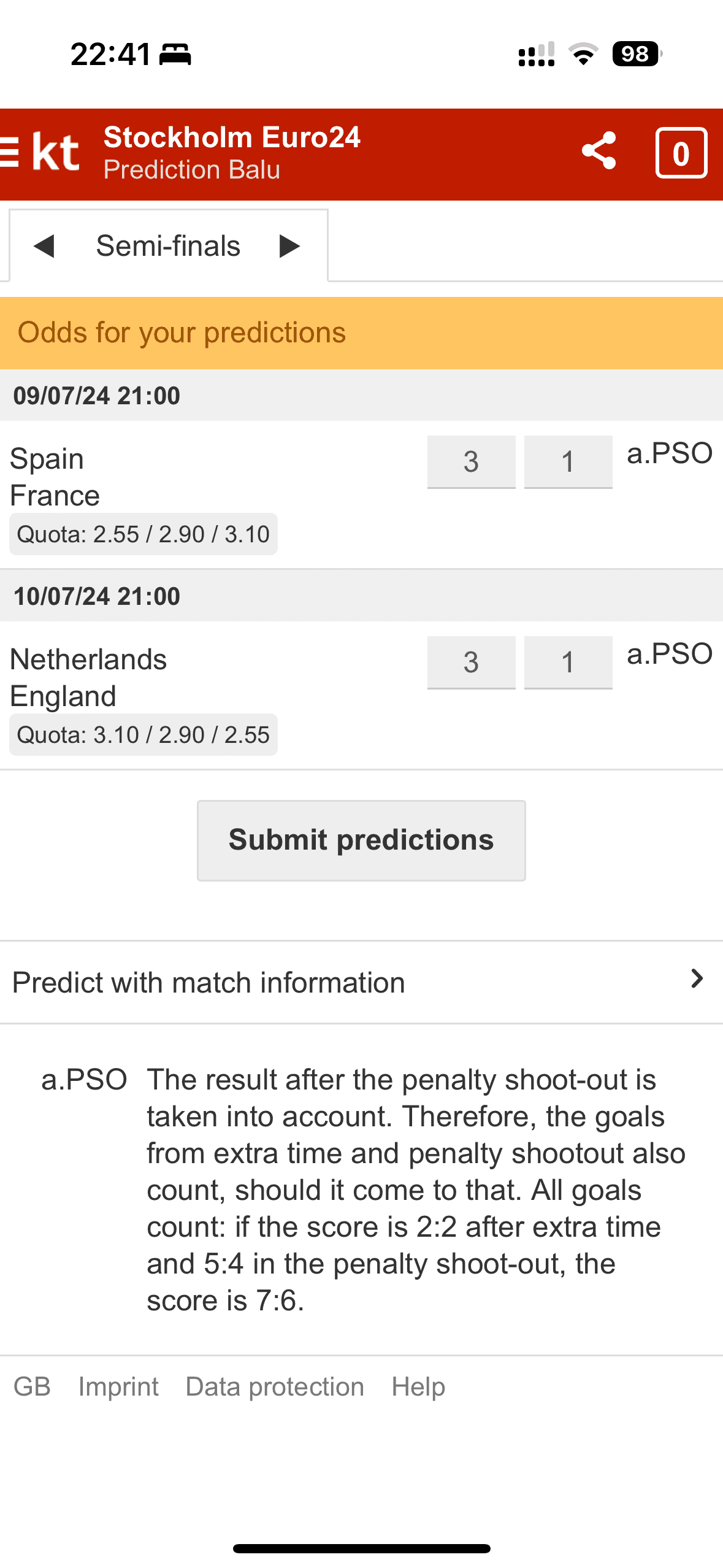
League switching
The redesign allows easy switching between leagues, whereas the original design required users to return to the home screen to change leagues.
Redesigned layouts
The match layouts have been redesigned to reflect a familiar match-day style.
Redesign
Prediction Section


Original
Leaderboard

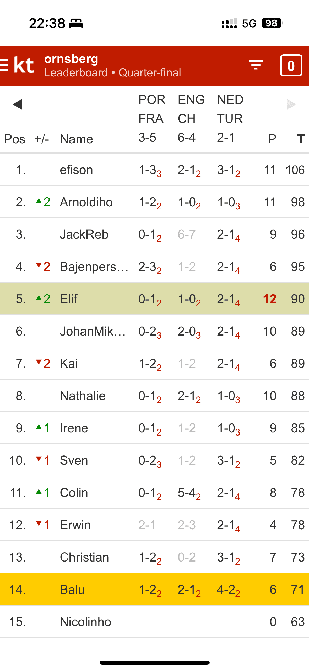
League switching
The redesign allows effortless league switching, unlike the original design, which required users to return to the home screen to change leagues.
Redesign & live updates
The layout has been redesigned to offer a quick overview of live sports updates.
Redesign
Leaderboard


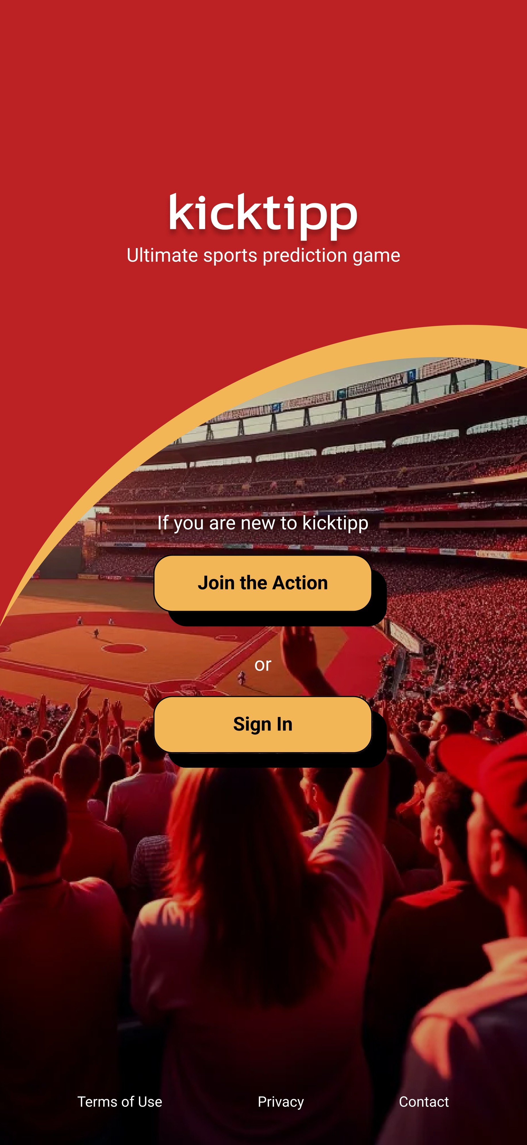
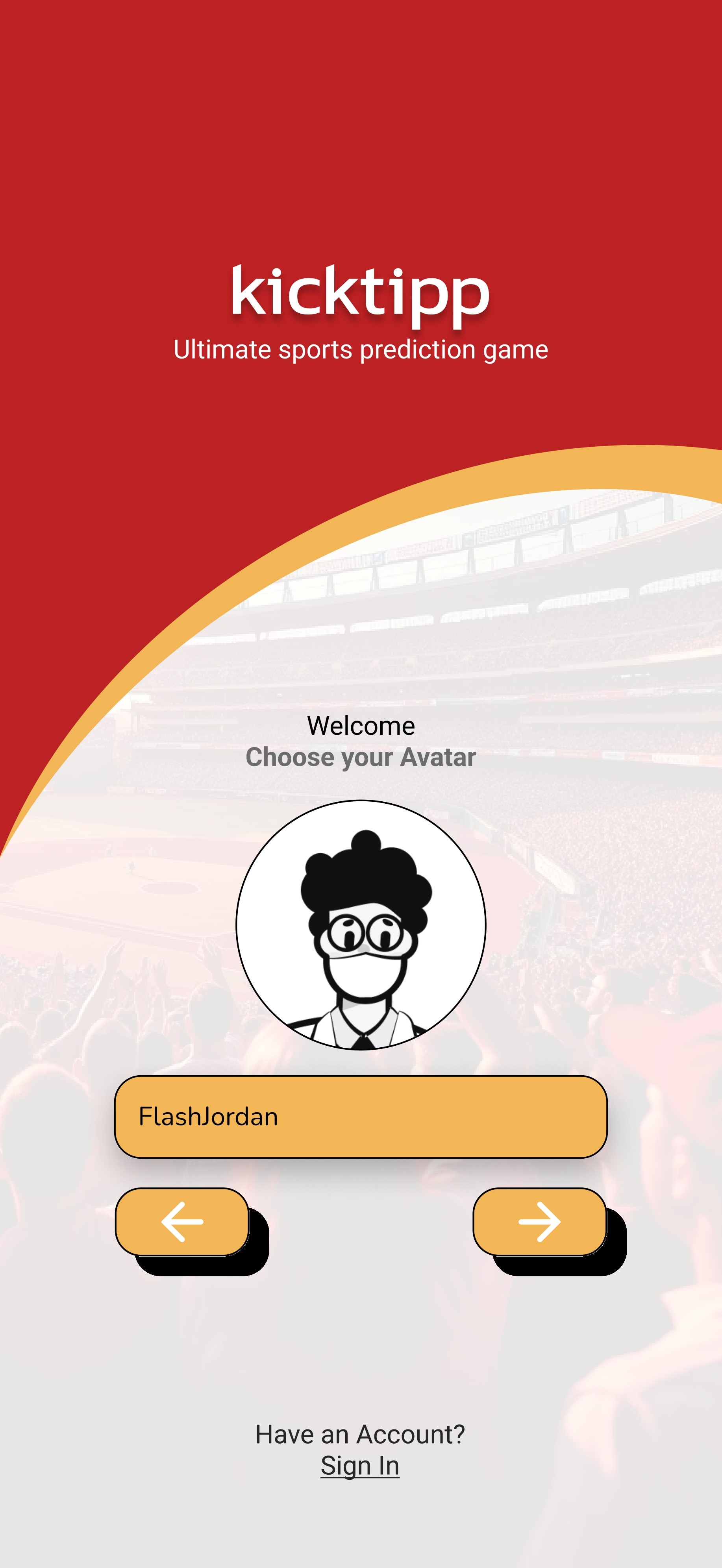
Joining the Game / with League Code
Emphasizing simplicity, the redesign streamlines the process of entering a league code to start playing immediately. The prototype illustrates the user journey from joining the app to reaching the home screen.
Explore the upcoming Matches and Predict
The match layouts are designed with a familiar industry-standard format, allowing users to switch between leagues easily. They can also view detailed information for each match, helping them make better informed predictions.
Simplified Leaderboard table & Chat
The leaderboard layout is simplified to clearly display your position, along with real-time stats to support your tracking.
Reflection
How can I improve the app experience?
What i have Learned
Importance of User Feedback
During the design process, I discovered that gathering feedback from real users was invaluable. Insights on usability issues and specific pain points helped shape the design decisions, making the app more intuitive and user-friendly.
Prioritizing Core Features
Initially, I was tempted to include multiple features, but I learned that focusing on core functionalities like predictions and leaderboard views was essential. By narrowing down the scope, I was able to improve user engagement with the most valued features.
Iterative Prototyping
Building low- to high-fidelity prototypes and testing at each stage taught me the importance of iterative design. Each round of feedback refined the user experience, helping identify and resolve issues early on.
Next Steps
Personalization & On boarding
To enhance user engagement, I plan to introduce personalized themes in the future. I also believe integrating an onboarding process is essential. In this design phase, my focus was primarily on overall user experience, but adding guidance in the login area would further improve usability.
Integrate Social Sharing Features
Considering the competitive nature of prediction games, adding social sharing could encourage users to share scores and achievements with friends, helping grow the app’s user base organically.
© 2025 Balu Suresh. All rights reserved.
